The smart ring built to end guesswork in training.
ORUKA is a smart ring and companion app built for gymrats who are done guessing their way through progress. I led this project end-to-end: field research, product strategy, UX/UI, brand identity, and industrial design direction, in collaboration with a hardware specialist.
DISCIPLINES
Product Design
Branding
Industry
Fitness & Wellness
Client

Oruka
Credits
Ishaq Tairou
Africa Design School
SKILLS
Field Research
Product Strategy
Figma
TIMELINE
Sept 2024 - June 2025
LONG STORY SHORT
I led the end-to-end design for a smart ring & app to help gym rats train smarter.
I chose this as my senior year capstone project at Africa Design School because I'd been living the problem myself for years. Once I had the green light, I turned it into a full, rigorous process. A few things that came out of it:
01
Research
Led field research across 128 participants, gymrats, coaches, and beginners, including a week-long diary study.
02
Product Strategy
Chose the product direction through real user data, then built a three-tier model so ORUKA never requires owning the ring to start.
THE PROBLEM
A phrase I used to repeat on the days training felt pointless
As a gymrat myself, there was a phrase I used to say to myself on the days training felt pointless: push-ups, pull-ups, and still the same reflection in the mirror. When it came time to pick a real-world challenge to solve for my degree at Africa Design School, the 1st digital design school in West Africa, I didn't have to think twice. I'd been quietly obsessing over this problem for months. I just needed the tools and the rigor to actually study it.
128
Participants
3
Groups: gymrats, coaches, beginners
10
In-depth interviews
94%
Report stagnating in progress
RESEARCH
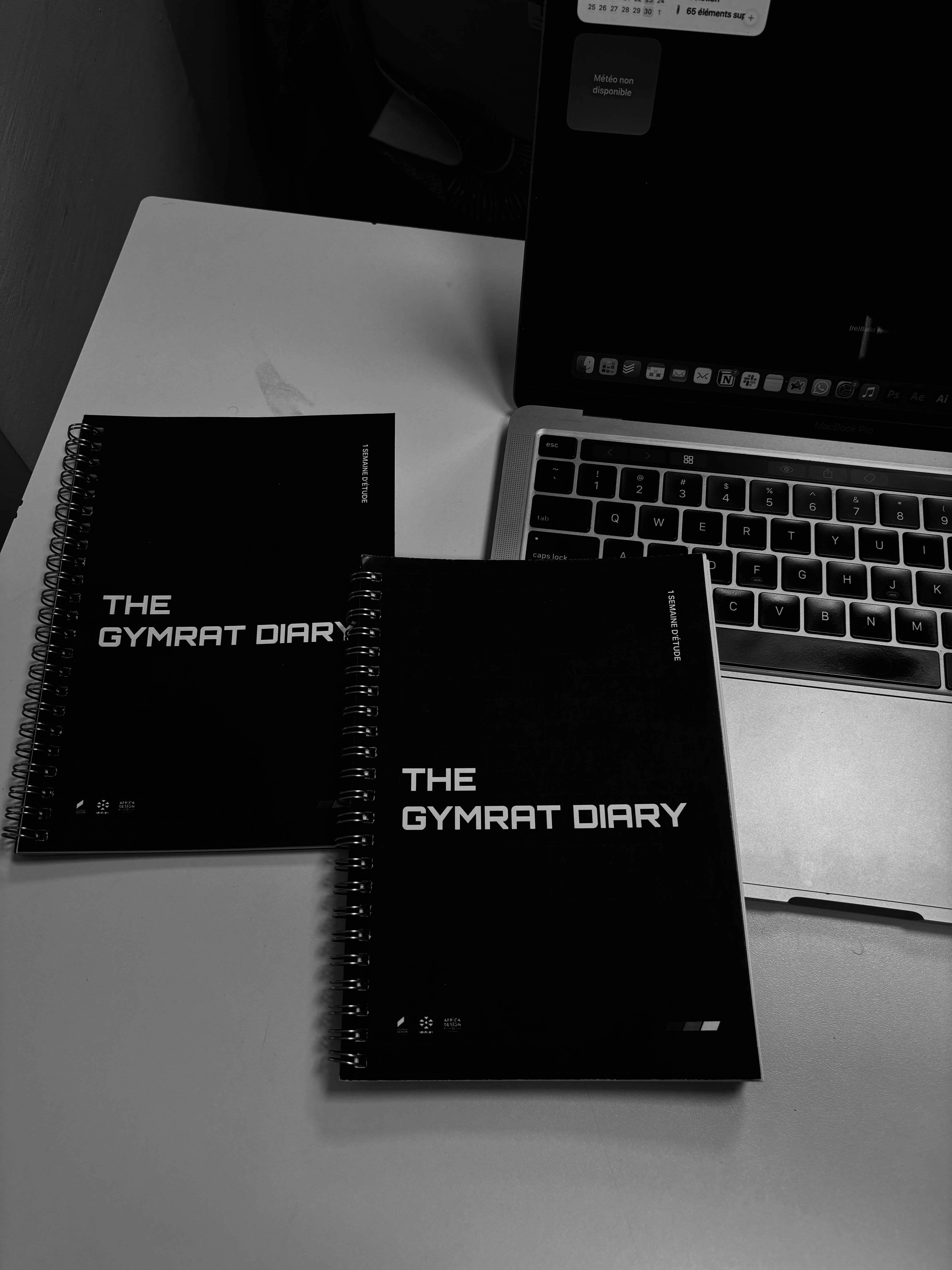
I built two layers into the study. A quantitative survey to map patterns at scale, and a qualitative side for deeper answers: interviews with selected gymrats and coaches, plus something I called the Gymrat Diary, a week-long probe where a group of gymrats logged their sessions, their stress levels, how they felt day to day.
"Training for a woman has nothing to do with training for a man. Most coaches I've worked with have no idea how my cycle affects my ability to stay consistent."
Gymrat, Cotonou
"
A lot of coaches today don't really know anatomy, because they never got proper training in it.
Coach, Cotonou
"
66% cite fatigue as their top obstacle, 63% lack of time, 44% lack of motivation. The numbers matched what I already felt in my own training. People were still showing up. They just didn't have what they needed to keep moving.
DIRECTION
Three directions, decided by data
To narrow it down, I ran a scoring workshop with 20 people from the research group, gymrats, coaches, and beginners, and had them evaluate all three directions against five criteria: impact, feasibility, innovation, long-term viability, relevance. I wanted the direction to earn its place, not just feel right to me.
The personalized support direction, built around tracking the athlete's own data, won clearly.

CONCEPTS
A direction isn't a product. So I built three.
ORUKA. A smart ring and app that tracks performance and recovery. Iboju. An interactive screen in the gym, syncing live with a user's profile. Digi IT. A smart mirror that reads your movement and gives you feedback as you train. I named the first two myself, in Yoruba, the language of my ancestors.
Oruka means ring, or circle. It fit the product, obviously, but it also fit something else I kept hearing in the research: people wanted this to feel less alone, more like something shared. Iboju means screen.
ORUKA won. Strongest on impact and innovation by a real margin, and it held its own on feasibility too, which mattered just as much to me as the exciting numbers.
DESIGN DECISIONS
No screen. A ring, not a bracelet.
I ruled out a watch almost immediately. I didn't want a screen at all. Everything that mattered had to live in the app, not on the wrist.
That left a ring or a bracelet. A bracelet is easier to build, with more room for sensors, and more forgiving on battery. But it's also something you notice you're wearing. A ring disappears on your hand. In a context like Cotonou, where training often happens in public, shared spaces, I wanted something that felt personal, not like gear.
The harder decision wasn't about the hardware at all. My first instinct was to think about what to show: charts, numbers, a dashboard. I stopped myself from going down that road. The point was never to hand someone more data to stare at. It was to take everything the ring collected and turn it into a program that adjusted itself. Less reading, more doing.


VISUAL SYSTEM
Black, an electric green, and a typeface built to push you
I went with black and a bright yellow-green as the accent color, for contrast, so the interface stays readable in a gym at 6am, but mostly because that green had to carry energy, health, momentum.
For type, I picked Orbitron. Sharp, technical, almost mechanical, but still energetic rather than cold.
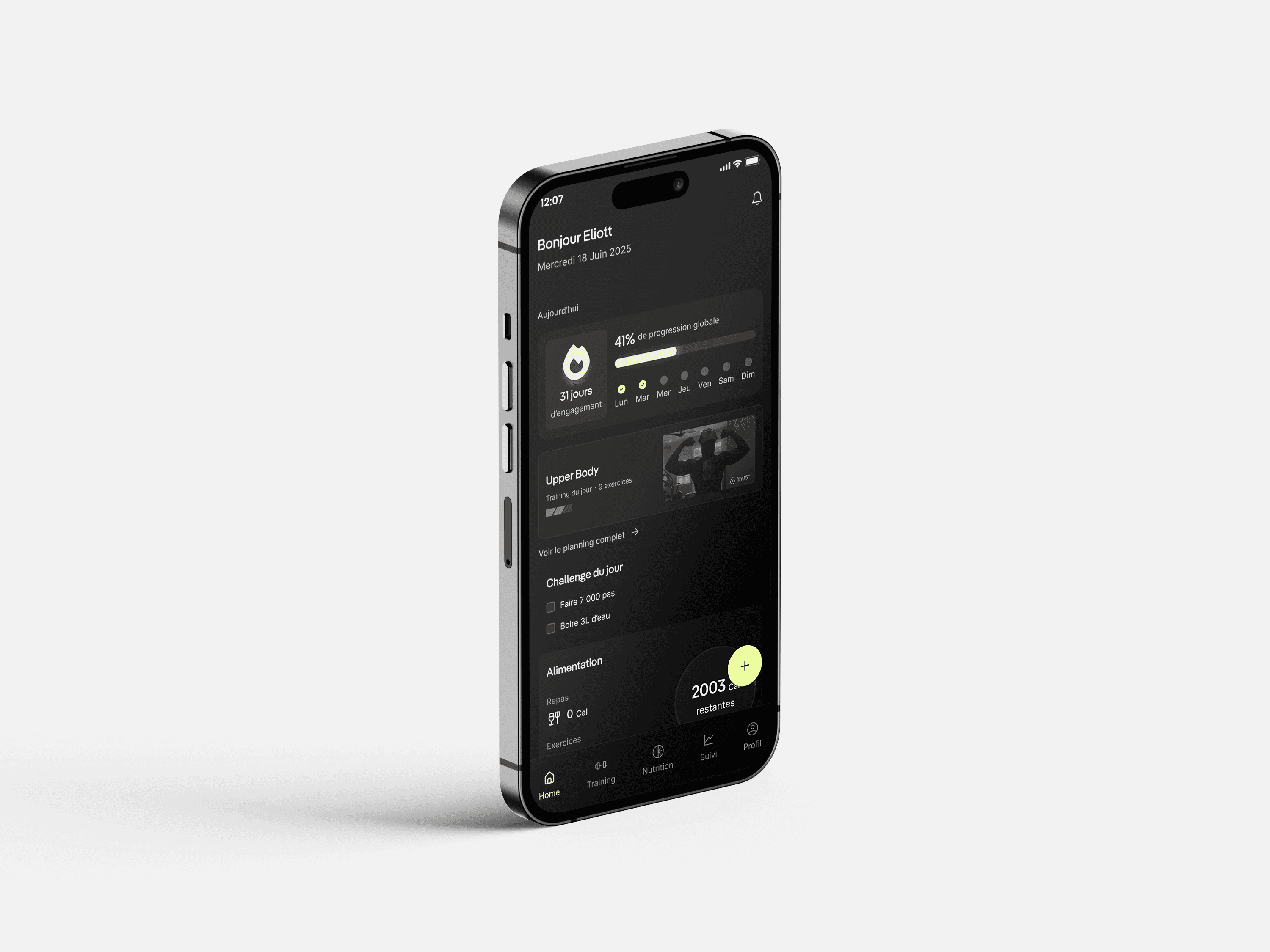
The home screen follows the same logic. It's not built to be read. Progress percentage, the day's workout, a daily challenge: everything on that first screen is meant to move you off the screen, not keep you on it.
THE PRODUCT
One system, built to move you off the screen
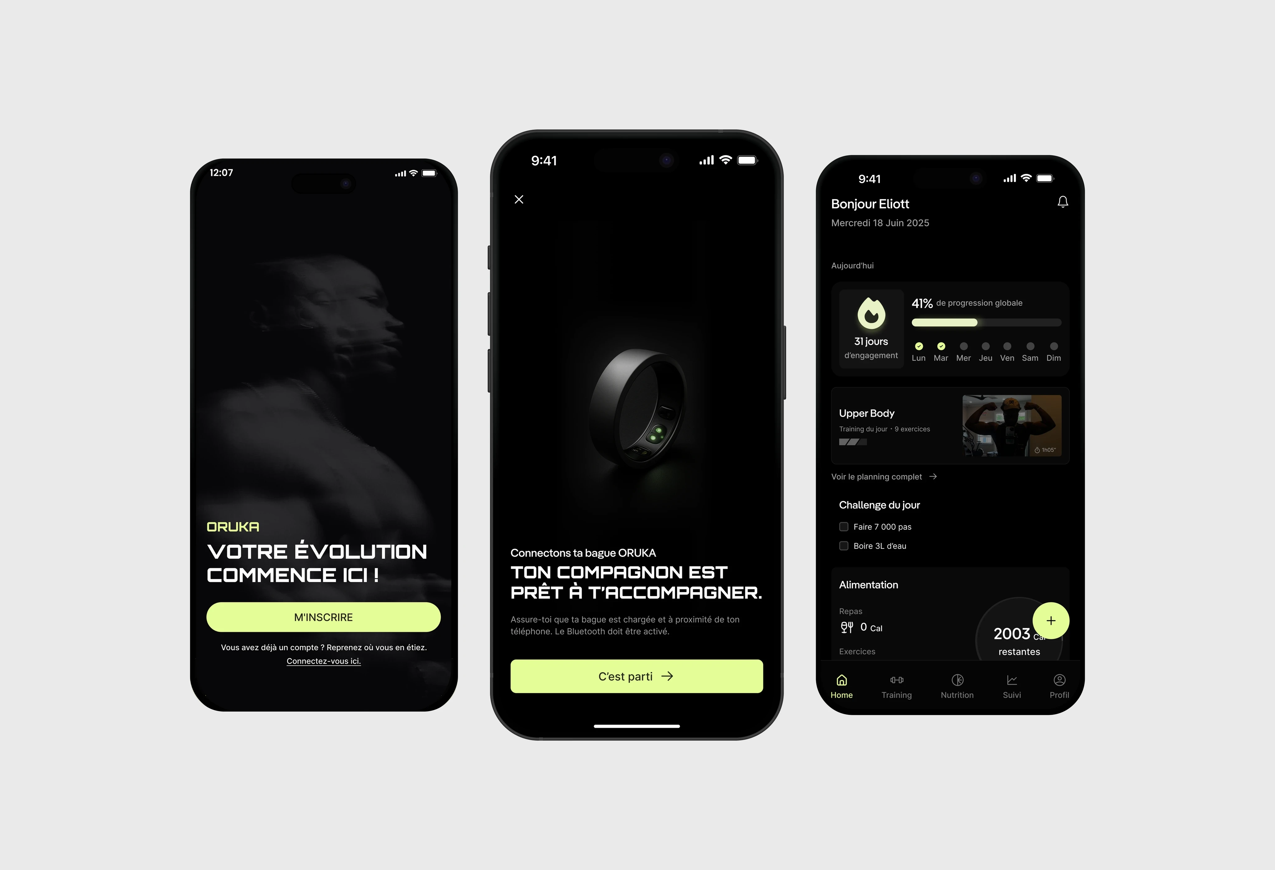
These are just a handful of the 100+ screens and states that make up ORUKA.
Getting started with ORUKA means answering a lot of questions, and every answer feeds directly into the program the app builds.
The home screen is built to be glanced at, not read. Weekly progress, the day's workout, a short daily challenge, remaining calories, all visible without opening anything.
Nutrition works the same way. Calories remaining sit front and center. Logging a meal doesn't force you into one workflow: scan a barcode, search normally, or just talk.
The tracking screen is where the ring's data actually gets used. Every metric comes with a short, plain-language read on what it means and what to do about it.
TESTING & ITERATION
Real feedback from 10 users, and one screen that changed because of it
I tested the prototype with 10 people. Every one of them said they'd want to use ORUKA for their own training. Every one of them also gave feedback that changed something.
One piece of feedback stood out: the food logging flow. It started as a simple text search, nothing else. People kept asking the same question: what if I don't want to type every ingredient by hand? That friction was real enough to slow people down, even in a prototype.
Before, tapping the "+" on the nutrition screen dropped you straight into a basic search. After, it opens a choice: simple search, scan the meal with AI, scan a barcode, or search by voice. Same goal, less friction to get there.

FEEDBACK
Thank you so much!
"His combination of discipline, intellectual curiosity, leadership, and integrity places him in the top 1% of the students I have trained.
[…]
His major project, ORUKA, showcased exceptional methodological discipline, strong analytical capabilities, advanced UX and research skills, and a rare ability to articulate both conceptual and business-oriented thinking."
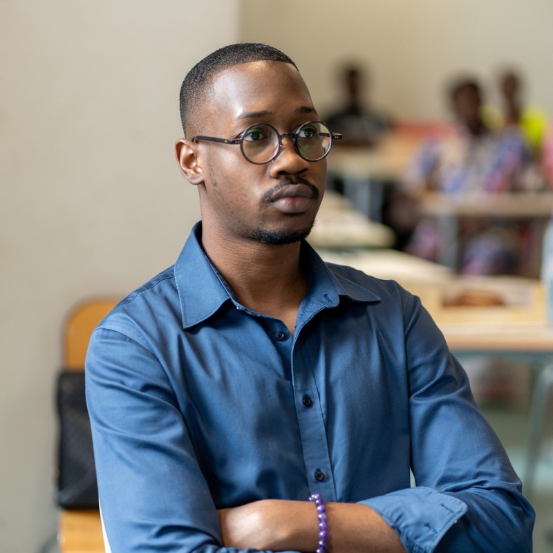
Hugues Wilfried Nagnonhou
Educational Manager, Africa Design School
"
"Ishaq distinguishes himself through seriousness, attention to detail, autonomy, and strong organizational skills. His ability to progress rapidly, integrate feedback effectively, and challenge assumptions demonstrates a solid foundation in critical thinking.
[…]
The work he delivered on ORUKA reflects his strong capabilities in UX/UI design, problem-solving, and project management. Despite challenges and personal constraints, he demonstrated exceptional perseverance, consistently pushing the project forward to a high level of refinement and coherence. This determination is just one of the many qualities that position him among the top students of his cohort. "

Micrette Tohoungnan
Educational Manager, Africa Design School
"
LEARNINGS & IMPACT
Designing ORUKA meant becoming a little bit of everything else first.
Some days I was reading about hormonal cycles and recovery science. Other days I was on the phone trying to understand subscription pricing, or figuring out how a ring actually senses a heartbeat. None of that felt like design work while I was doing it. But every screen I ended up building only made sense because of everything I'd had to learn just to get there.
The project didn't end at the presentation.
I want to keep building ORUKA alongside my classes, using AI to move faster on software, and I'm looking for a hardware partner, since that's outside what I know how to do right now.
It changed how I train, even without the ring.
I understand my own training better now, why things stall, what actually needs tracking. But I still catch myself wishing I had a ring on my finger telling me the truth about where I'm actually at.