The budgeting app built for HBCU students.
Drift is a mobile budgeting app designed specifically for HBCU students. I led the full design end-to-end: user research, analysis, flows, wireframes, brand identity, design system, and hi-fi screens in Figma. The result is an app that tracks spending in real time, breaks down categories, and gives students a daily score that tells them exactly where they stand before they run out.
DISCIPLINES
Product Design
UX/UI Design
Branding
Industry
Fintech
Client

Drift
Credits
Ishaq Tairou
Xavier Partee
Tyshan Wilson
SKILLS
Field Research
Product Strategy
Figma
TIMELINE
April 2026

LONG STORY SHORT
I led the design and systems side of a budgeting app built for students living on irregular, family-dependent income
DRIFT started as a class project at NC A&T, but I didn't treat it like one. I'd been the one paying attention to this problem long before we picked it as our team's focus, so once we did, I pushed for the same rigor I'd give a real product. A few things that came out of it:
01
Research
Co-led field research across 53 students, 4 in-depth interviews, and a 9-app competitive teardown, to confirm the problem was real before designing a single screen.
02
Design & Systems
Built the entire design system and all 26 hi-fi prototype screens myself: color tokens, typography, components, and every interaction state.
03
Design & Brand
Ran usability testing that caught a real discoverability failure, and shipped a fix before the final submission.
THE PROBLEM
An immigrant's crash course in a new way of handling money
I moved to the US in 2025, and one of the first things that hit me was how differently money works here. New banks, new apps, new rules around credit, a completely different rhythm.
The more I paid attention, the more I realized it wasn't just me. Every student I talked to had a version of the same complaint, always a little short, always assuming the answer was to earn more. I kept coming back to a different question. What if the problem wasn't how much money we had, but that nobody had ever shown us how to actually use it?
Every budgeting app out there seemed to quietly assume the same user: someone with a steady job and a bank account they'd trusted for years. That wasn't me, and it wasn't anyone I knew.
53
Students
4
In-depth interviews
9
Competitors analysis
26
Screens designed
RESEARCH
Tyshan led the field research; I worked alongside him shaping what we asked and why. We ran it in two layers: a quantitative survey to map the pattern at scale, and qualitative interviews to understand the "why" behind the numbers. On top of that, we tore apart 9 existing budgeting tools, YNAB, Mint, EveryDollar, Goodbudget, Rocket Money, and others, to see exactly where they broke for someone like us.
I used to use Notion but having to type every purchase manually made me give up.
NCAT student
"
I need a savings account my family can't access.
"
NCAT student
77% of students blamed small daily purchases for running out of money. 70% said family support was their primary income source, not a job. And 90%, combined, had no reliable way of tracking where their money went: 47% tracked nothing at all, 43% relied on "mental tracking," which is just another way of saying nothing.
The competitive teardown made the gap even clearer. Every single tool we reviewed assumed a stable paycheck, a bank account worth connecting, and 20+ minutes of setup effort a student doesn't have the patience for. None of them were built for irregular income. None of them were built for us. Three hypotheses came out of this cleanly confirmed:
Money disappears through small, daily, untracked purchases, not one big mistake.
Budgeting tools fail because of setup friction and manual entry, not lack of motivation.
Students want a savings mechanism their family can't touch, and nobody had to ask them twice. Three separate interviews brought this up unprompted.
That last one surprised all of us. We'd guessed at it. We didn't expect it to surface on its own, three separate times, without a single leading question.

DIRECTION
Letting the data write the feature list, not the other way around
We didn't sit down and brainstorm what a budgeting app "should" have. We took the three confirmed hypotheses and let each one point directly to a piece of the product.
H1 meant the app couldn't wait for the user to review their spending at the end of the month. It had to show drift in real time, the same day the money moved.
H2 meant there could be no manual entry, anywhere, ever. If a student had to type a single transaction by hand, we'd already lost.
H3 meant a savings feature had to exist that put a wall between the money and the family checking in on it, even if that came later in the roadmap.
The clearest signal from the research was this: 32% of students said they do track their spending, and it still doesn't change their behavior. Visibility alone wasn't the fix. The intervention had to happen before the money was spent, not after someone glanced at a chart. That single finding is the reason DRIFT's entire dashboard is built around one live number instead of a report you check when it's already too late.
WIREFRAMES
Getting the structure right before it looked like anything
Before any color or type decision, I built low-fidelity wireframes in Figma to lock the structure each hypothesis demanded. Where the Drift Score sits on the Dashboard, how budget entry points appear, what the savings flow needs to include, all worked out in grayscale first, so no visual polish could hide a layout that didn't actually serve H1, H2, or H3.


VISUAL SYSTEM
Orange with intent, and a typeface split between voice and data
The system runs on one accent color, #FF7733, with a full neutral ramp from black to near-white, plus dedicated Success, Warning, and Error colors, so every state, good standing, holding, over budget, gets its own emotional register instead of borrowing the accent for everything.
Type splits in two. Plus Jakarta Sans carries headings and marketing copy, matching the DRIFT wordmark for a consistent brand voice. Inter handles every number and line of body text, because at 6am checking your Drift Score, legibility beats personality.

THE PRODUCT
One app, one job: tell you where you stand before it's too late

One number, that's it
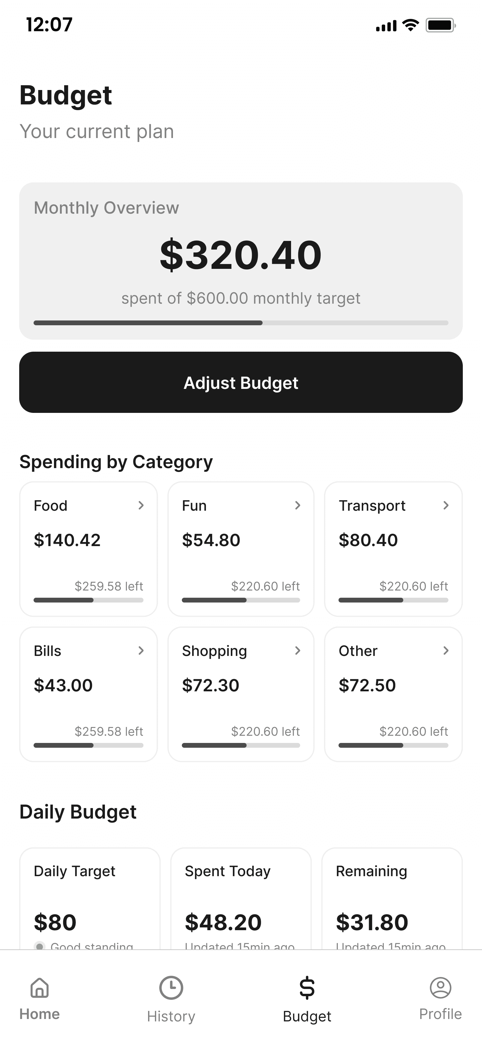
Students already had numbers everywhere, Venmo, Cash App, their bank. What they didn't have was one number telling them if today was fine. The Drift Score does that: a single 0-100 read on how far you've drifted from target.

A nudge, not a wall
Budget alerts at 75% and 100% show as pop-ups, not full-screen takeovers, so the Dashboard stays visible underneath and the alert feels like a nudge, not a punishment.

No manual entry, anywhere
Every transaction comes in through Plaid, auto-categorized. Manual entry was the number one reason students quit a budgeting app in our interviews.
Onboarding under two minutes
38% of students never start because the setup feels like too much. So onboarding asks only for the essentials.
TESTING & ITERATION
The Budget tab nobody could find, and the fix that shipped because of it
We tested with real participants across three sessions. A fourth test case, spending history filtering, stayed untested, Figma prototypes don't hold live transaction data to filter against.
Drift Score fix
Once on the Dashboard, our participant didn't understand what the Drift Score meant, and had no idea what kind of alerts to expect.
Before: No explanation on first visit.

After: A pop-up explains the Drift Score in plain language the first time you land on the Dashboard.
Budget fix
Asked to locate their spending limits, our participant needed guidance; they didn't find the Budget tab on their own.

Before: Budget only reachable through the navbar icon.
After: Two new entry points added: a button in the welcome pop-up, and an "Adjust my budget" button right on the Drift Score card.
Both alert screens and the rest of the Dashboard flow passed cleanly. Our participant called the alerts "genuinely useful" and suggested, unprompted, a morning notification reminding her of the day's budget, now on the roadmap. We also made 17 smaller UX writing fixes across the flow.
LEARNINGS & IMPACT
The hard part wasn't visual but resisting the instinct to show more.
Every early Dashboard I sketched had more numbers, more charts, more ways to feel "informed." Cutting it down to one score was the real work, because the research kept saying the same thing: students didn't need more data, they needed one honest answer to "am I okay today."
This isn't ending with the class.
I want to actually launch DRIFT at my school before I graduate, and I'm already preparing to go back into research, deeper this time, to get it ready for that. This case study documents where it stands now, not where it stops.
DRIFT proved the process traveled with me.
It was my first project in the US, and it proved something I wasn't sure of yet: the rigor I'd built back in Africa, the instinct to go find real users before designing anything, wasn't tied to one context. What didn't come easy was doing all of it in English for the first time, interviews, writing, presenting, in a language and a culture I was still learning myself. That discomfort turned out to be part of the point.